So, here’s the deal. Some startup founders at Curebit.com decided to copy a design used by 37signals’ Highrise product for their own app. They did this in a less-than-gracious way, by simply copy/pasting the code and even leaving in some hard links to the original code. The story on VentureBeat tells the full story.
The founder of Curebit responded on HackerNews with this:
We had a different homepage, were a/b testing different pages, came across the 37signals post and were like ‘wow we should see how that converts!’ We are big fans of rails and what 37signals is doing and did not really think through the implications of what we were doing. We just kind of thought about it as a fun test to run.
Clearly it was stupid. It was not meant to offend anyone and we are adding credit where due.
As I pointed out to @dhh on Twitter, it’s unlikely this explanation is actually valid, given that their pricing page is also basically identical to Basecamp’s.
Clearly, @dhh isn’t amused with the founder “digging deep” for excuses. He wrote:
@allangrant THERE IS NO VALID WAY TO RIP-OFF PEOPLE’S DESIGNS AND HAVE IT BE OK. Not we’re small, not we’re a/b testing.
I think @dhh’s real frustration is that the founder isn’t admitting what is obvious to everyone else. He liked 37signals’ design. He thought it was good. And rather than get inspired by it and design something derived from the good concepts in the original, he and his team simply ripped off the original.
I think what this whole argument is missing is a little honesty. The truth is, no one on the web designs in a vacuum. We are all continually inspired / deriving from each other. If we were to believe that every marketing page and product homepage were designed by an obsessed designer living in an ivory tower, we would be in a total fantasy land. That’s not the web. Even designers are borrowing from, and getting inspired by, each other. Hell, that’s half the point of a site like Dribbble or Forrst.
Some honesty, for once: Parse.ly’s recent design
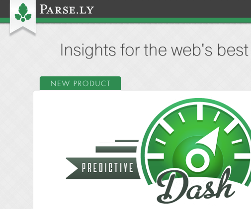
For our Parse.ly Dash public launch, we recently redesigned Parse.ly’s homepage and Dash’s marketing materials. I’m going to try, in this post, to outline all the sources of inspiration we drew on — some more directly than others — to land at the current site design (which is still a work-in-progress).
We started with the homepage
So, first some caveats. Parse.ly’s current branding and website design was put together by a sort of informal collaboration between two designers we work with. We found those designers on Dribbble and we paid them retainers to work through the designs. Our last homepage was basically a “v1” of this design. In between our prior homepage launch and the latest one, our original designer left us and so we hired someone with similar sensibilities to inherit his work and improve upon it. This landed us at our “v2” homepage design, which is the current one. For it, we mainly improved our color palette, branding elements, and clarity of presentation. Our awesome engineering intern, Emmett Butler, also took the opportunity to convert the design over to Hyde, a Python static website generator, so it would be easier to maintain.
For our recent launch, we also hired a firm, LessFilms, to produce our overview video. We wanted this video to be a mere click away on our homepage, so the new design needed to offer a way to launch the video.
As a team, we believed our homepage should be simple, drive people to watch our video, and drive people toward our signup form where we could then follow-up with them and evaluate if they might be good potential customers. We also wanted the page to be infused with the Parse.ly brand, but showcase the Dash product in a bold, but clean, way.
Our basic homepage design came straight from wireframes from our designers. I was the one who produced the initial HTML/CSS markup, this then became a shared project with my other colleagues at Parse.ly.
We used good, open source components
I quickly realized the topbar could be modeled well by Twitter’s Bootstrap framework. We ended up using modal dialogs from that framework for the video display, their grid framework for the footer, and popovers for our pricing page, as well. I also liked the idea of showing some screenshots right on the homepage. So I integrated our wireframe with the NivoSlider jQuery Plugin, so we could conserve space while having nice animation effects, to boot.
We solved problems with simple — and tested — elements
We wanted our tagline, “Insights for the web’s best publishers”, and our intricate Dash logo masthead, to stand out on the page. But we faced a clear problem: how do we get people to realize there was a video to watch?
We chose to go more abstract than explicit. We used a “play” button very much inspired by Dropbox’s play button on their homepage. Ours is a bit smaller and tucked in the corner of our product pane, but served the same purpose — nearly 50% of our homepage visitors click this main area as a result.

We were able to reproduce something that looked like Dropbox’s abstract play button in Photoshop and made it match our color scheme and branding.
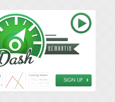
This was clearly a case of us borrowing a design element. But I don’t think the Dropbox guys will mind — how many different ways are there to design a “play video” button, after all? We recognized a play button was needed, and we looked toward a use “in the wild” to get the right idea across.
We tried not to sweat the small stuff
A similar example of a small problem we solved by looking elsewhere is our homepage footer. Our friends at SeatGeek have had a nicely-designed homepage for a long time. I follow the founder Jack on Twitter and we talk about design occasionally. Heck, I was in the same room when Jack and Russ were brainstorming the name for SeatGeek. Likewise, they were in the same room as us when we came up with name for Parse.ly.
So when we needed to think about how to design our footer, we took a look at a few sites on the web, including those of our friends, and found that SeatGeek’s seemed like a no-nonsense, minimal fuss footer that was clean and crisp. We simply sent our designer a note that said, “let’s make the footer have similar proportions/look-n-feel to seat geek.com.”
His first revision came back pretty ugly, and we were confused. Then we realized the space in the original email — he thought we meant geek.com (which does have a pretty ugly footer), and indeed, he was “confused why we were inspired by it”.
At that point we corrected the error and decided to get more explicit about what we wanted. The typo was a good opportunity to reflect a bit. We liked these attributes of SeatGeek’s footer design: First, it inverted the color scheme (white-on-black rather than black-on-white) to create a dark break from the rest of the site. Second, it had a call-out to the logo/brand. Third, it had plenty of room for columns and columns of links. We sent out these instructions with a screenshot. We also indicated not to go too crazy/ornate on this — it’s just a footer, after all. As much as I love Vimeo’s footer, we had a website to launch, damnit! (If you haven’t seen Vimeo’s footer, you need to take a look!)
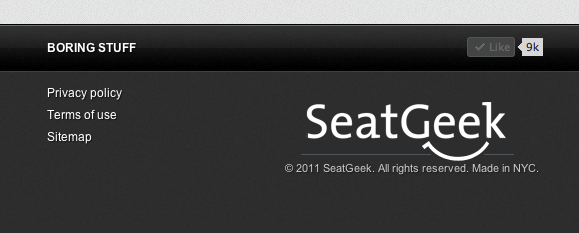
In the end, our footer design ended up pretty close to SeatGeek’s. We obviously have a different highlight color (due to our brand), different fonts (also due to our brand), and a different logo/tagline. But pretty much the same from a proportions / spacing / concept standpoint.
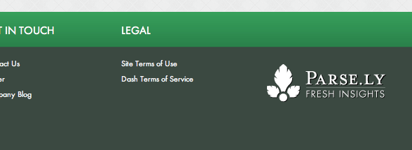
Is this design “stolen”? No, I’d say this is a pretty simple example of “recognizing good stuff” and “doing similarly good stuff”. Our footer is our own design, inspired by SeatGeek’s. Who knows who SeatGeek was inspired by in theirs? Thus is the constant process of remixing and derivation that happens in a creative world, especially on the web.
Sometimes, good design is “obvious”
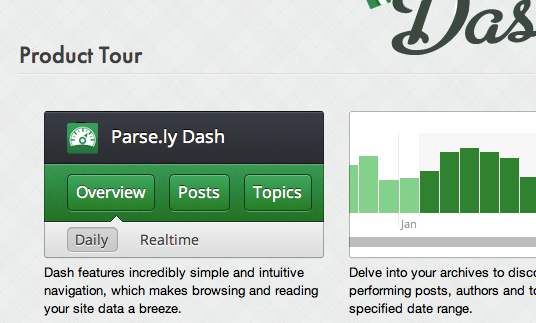
We wanted to have a nice product tour page that showed screenshots of our product in an easy, visual, clickable layout. We wanted a little more detail to be revealed here as compared to the video, which gave a more high-level overview of the problem the product is solving. This would be a page to recognize the live product’s existence and its design.
I also didn’t want the design of this page to be intricate, because I thought our product screenshots would do a good job speaking for themselves. I solicited opinions from my team about product tour pages that met these criteria. The most-liked one was a pretty “obvious” grid layout of screenshot thumbs and captions put together by the creators of the Flow task management app that one of my colleagues uses.
It is a simple grid with embossed screenshot frames and 100% zoomed detail crops of the textured user interface. Each thumb has a caption and a link to the full-size version. It seemed perfect and obvious.
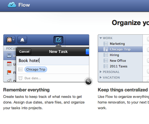
So, we whipped together some screenshot thumbs of our own, integrated it again into our product and company branding, and ended up with our version.
Did we steal Flow’s design? Hardly. A grid of product screenshots and captions is about as straightforward as web design gets. But we thought some of the other choices — 100% zoom, embossed, captions, clickable — fit our needs well.
Some inspiration is less direct
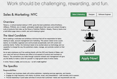
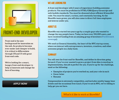
I know I was indirectly inspired by ShowMe’s jobs page, which I think is just downright pretty.
Our jobs page only shared some conceptually similarity — big “Apply” buttons, a two-column layout, some iconography to break up the dry wall of text.
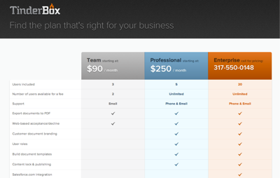
Likewise, our pricing page is extremely barebones at the moment (we have a few designs floating around internally). The one that provided the most root inspiration to me was Tinderbox’s:
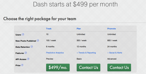
In the end, we landed on something quite a bit less ornate, a bit easier to read, and with a bit more detail available via anchor links.
So, what’s the point?
I’m a little disappointed how dishonest everyone in the startup world seems to be about design. I think one form of dishonesty is to outright steal someone else’s, like the Curebit guys did, via a crude copy/paste. But another form of dishonesty is to pretend as though all web designs need to be completely and 100% original. We all know that’s impossible.
Here’s my key takeaway: It’s OK to be inspired by other designs, but make sure to understand the source of your inspiration, and apply that in the context of your own brand, product, and company needs.
I can see why DHH is frustrated. For the last 5 years, he has watched copycat startups rip his products off left and right. The copycat culture on the web is a problem. But the reason it’s a problem isn’t because every design should be uniquely crafted from a raw block of marble.
It’s a problem because people copy without thinking, instead of letting inspirational sources cause moments of design reflection.
The web is a remix culture. What the Curebit.com guys did was wrong, but not because every website deserves a unique design. It was wrong because it showed that they were lazy toward their customers and disrespectful toward their inspirations.
Rather than remix the best design ideas they’ve seen into something that worked for their brand and customers, they decided to steal someone else’s and cross their fingers that it would work for them, too. And it backfired. But let’s not draw the wrong lesson. Design on the web is about remixing from your inspirations. There’s nothing wrong with that. It just needs to be done thoughtfully and respectfully.
Acknowledgements: thanks to Jack + Russ from SeatGeek, San from ShowMe, and Kyle from Forrst for reviewing and providing feedback on a draft of this article.

100% spot-on. The design remix culture and the use of design patterns is not just a reality of how the web works, but it’s also good for users. When design patterns stick, users become accustomed to interaction behaviors, and then it’s easier for them to use sites and find the information they’re looking for.
The key, as you said, is to point out design inspiration in the appropriate manner (posts like this, maybe?), and also to pick smart battles about when to introduce new design patterns (often based on the unique value proposition of your site / product). After all, if every design was 100% remixed, we’d never have innovative leaps forward.